|
Introduction to Charting and Charts
Charting is how one puts price, volume, open interest, and
the various technical analytical outputs into graphical format,
whether by hand with pen to paper or by computer software
to screen or printer.
The most common chart price format is the well known bar
chart with a vertical bar for the range of price for the period
and with a left horizontal tick for the opening price and
a right hand tick for the closing price. Another common chart
format is the line chart which lists only the closing price
for a given period.
The Japanese candlestick chart bar conveys the same information
as the stabndard price bar except that the portion between
the open and the close is thicker (the "body")than the remainder
of the bar ("the shadow"). At the very least, the candlestick
bar causes the open and close prices to stand out more vividly.
It is also widely believed that the candlestick bar pattern
is itself predictive. Murrey
has a useful site for candlestick charts.
Point and figure and kagi (or nehaba ashi) are quite old
charting methods of value which leave time out of the chart.
They are both excellent for trend breakout trading. Hobson
charting is a virtually unknown method which we may discuss
in the future.
One of our favorite charting methods is that known as WinMidas.
This technique was developed by Dr. Paul Levine, formerly professor at Cal Tech.
The basic concept is that support and resistance are found at points where most stock was sold or bought. This is based upon an average daily price and cumulative on-balance volume. There is an 18 part seminar on this subject at WinMidas. Scroll down the page until you see it.
We publish WinMidas charts regularly. Links to them are found at the bottom of the home page.
There are several ways to "read" charts. The bible of chart analysis is Edwards and Magee's "Technical Analysis of Stock Trends" first written in 1946 but with new editions since.
Other approaches include the analysis of individual price/time
bars in relationship to previous bars both for visual momentum
and in terms of support and resistance. This is one of the
most valuable of all methods, but there is little which is
easily available to read. Some of the best places for this
type of analysis are on the Internet chat sites frequented
by daytraders. Gap Lines are another useful charting technique.
Several Metastock studies we like are the Money Flow Index and the Average True Range Study. 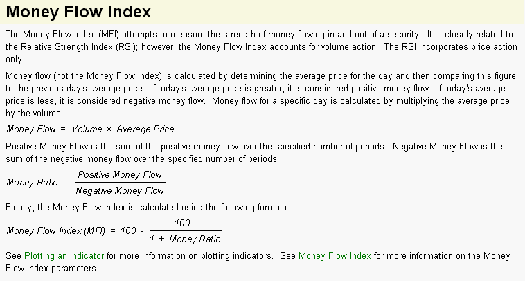 The interpretation of the Money Flow Index is as follows:
· Look for divergence/failure swings between the indicator and the price action. If the price trends higher (lower) and the MFI trends lower (higher), then a reversal may be imminent.
· Look for market tops to occur when the MFI is above a specific level (e.g., 80). Look for market bottoms to occur when the MFI is below a specific level (e.g., 20). In essence then, MFI is an oscillator of average price OBV. Thus it is a further look into the mechanics of WinMidas.
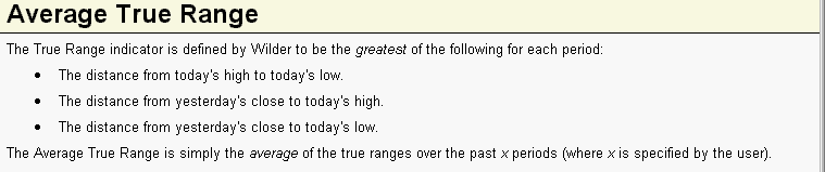
ATR is a measure of voaltility. While are many ways to measure and use volatility, ATR can help as an indication of trend versus consolidation/correction. As a very simple example, ATR declines during solid trends and increases in consolidations.
Home
|